Email, minus the overwhelm
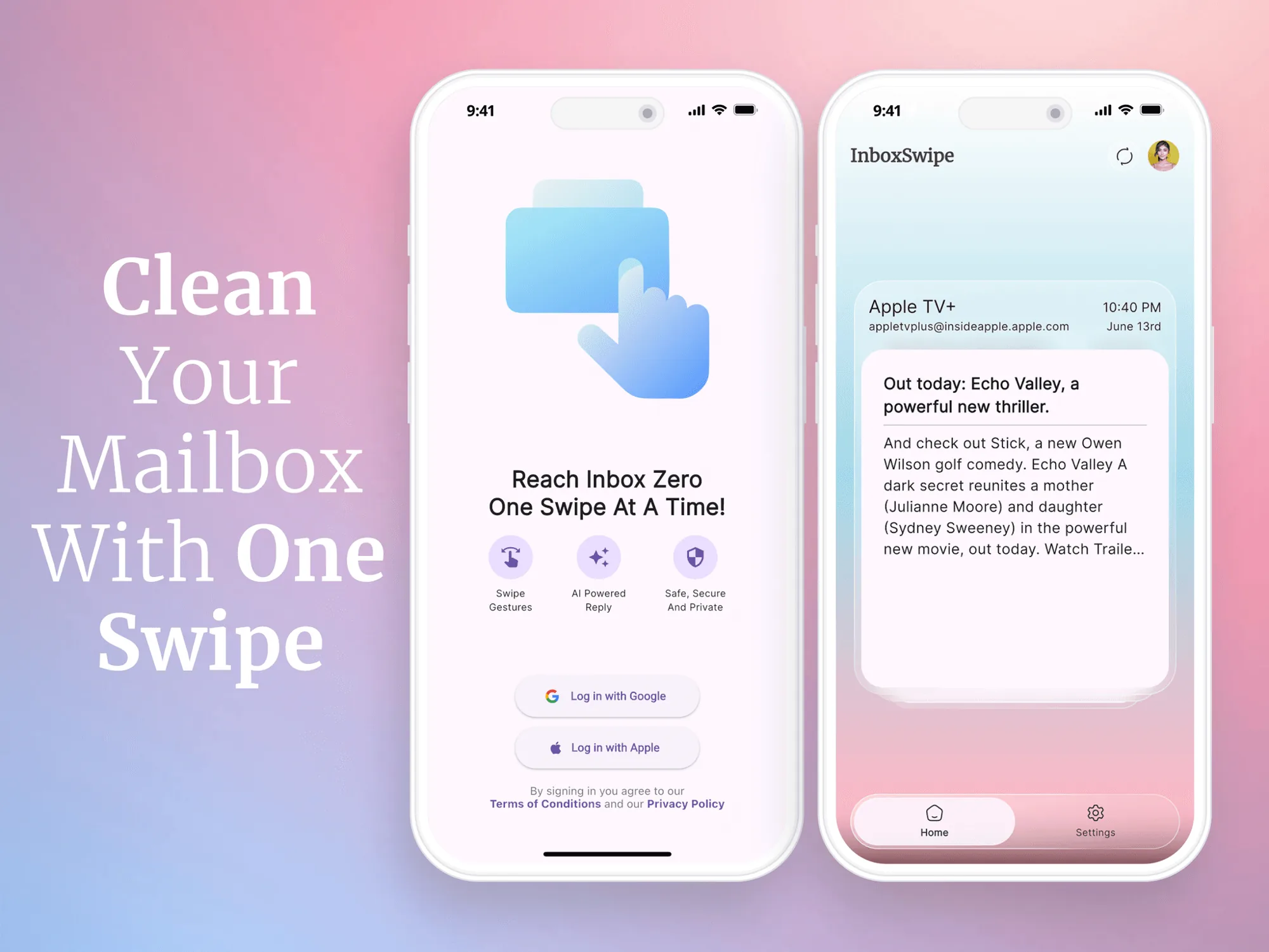
InboxSwipe is a mobile app that makes managing an inbox simpler. With so much digital communication, people struggle with huge volumes of email. The result is missed information, lost productivity and extra stress.
The app uses gestures to let people organise, prioritise and act on email with minimal effort. It focuses on speed, clarity and intuitive design to make inbox management feel seamless.
Nobody enjoys cleaning their inbox
Newsletters, promos, receipts and notifications pile up by the hundreds. Sorting them one by one feels endless, so most people give up and let the clutter grow.
Take a tedious chore and make it genuinely fun.
Rather than design yet another productivity tool, I asked: what if clearing your inbox felt less like work and more like a game you want to play?
Borrowing Tinder's swipe
The answer came from an unlikely place. Tinder turned a decision into a single flick of the thumb: one card at a time, one quick choice, instant feedback. It's addictive because it removes friction and rewards every move.
What if every email was a card, and every swipe was a decision? InboxSwipe rebuilds the inbox around that mechanic. Instead of a long, intimidating list, you see one email at a time. Glance, decide, swipe, next. Momentum takes over and inbox zero feels reachable.
Four directions, four actions
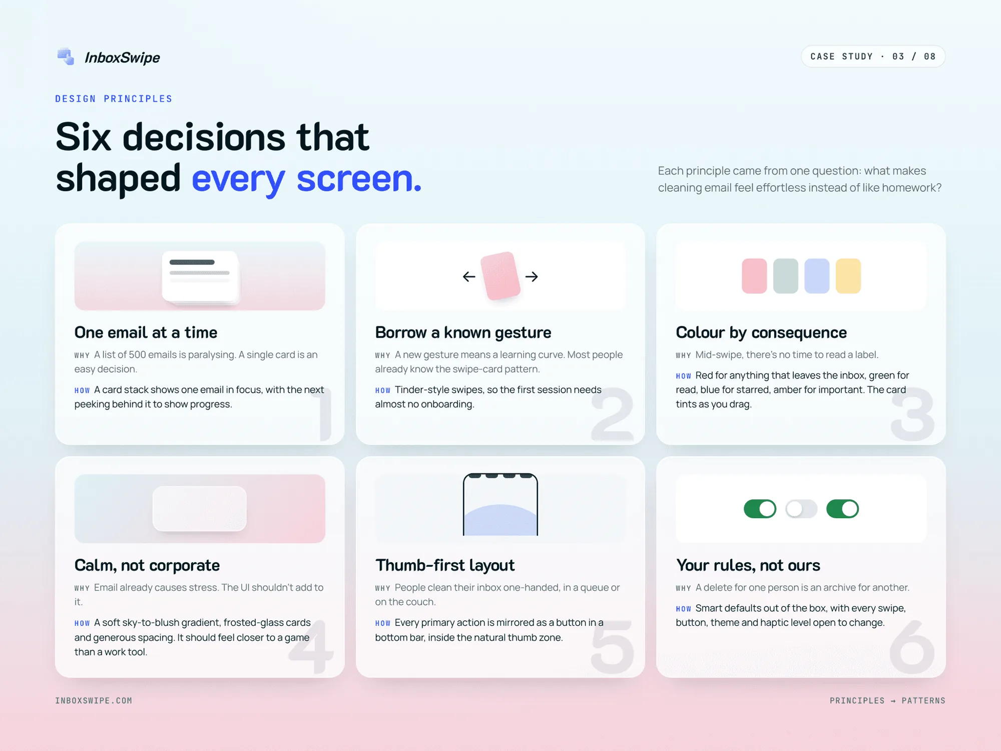
The most common inbox decisions map to the four natural swipe directions, so every action is one gesture away.
Delete
Swipe left. The fastest way to clear clutter.
Important
Swipe right. Keep what matters, like Tinder's "like".
Unsubscribe
Swipe up. Stop the noise at the source and clear every email from that sender.
Mark read
Swipe down. Deal with it once and move on.
Six principles behind every screen
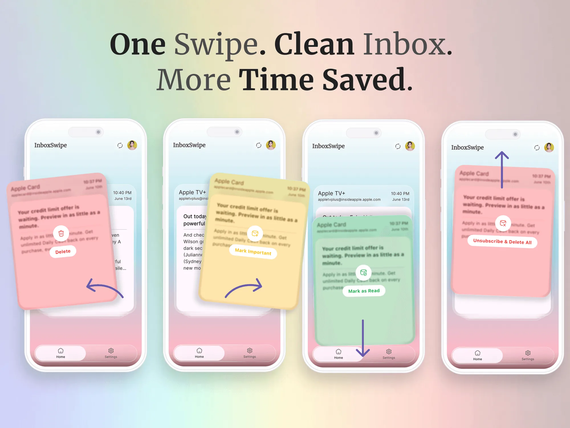
Before drawing a screen, I asked one question: what makes cleaning email feel effortless instead of like homework? Each answer became a principle, and every screen was checked against them. Two shaped the product most:
- Principle
Borrow a known gesture
Most people already know the swipe-card pattern, so the first session needs almost no onboarding.
- Principle
Colour by consequence
Mid-swipe there's no time to read a label, so colour carries the meaning.
Feedback before you let go
As a card moves, it washes in the colour of the action it's about to trigger, with a large icon and a clear label: red for anything that leaves the inbox, green for read, blue for starred and amber for important. Users know the outcome before they release, which builds confidence and prevents mistakes.
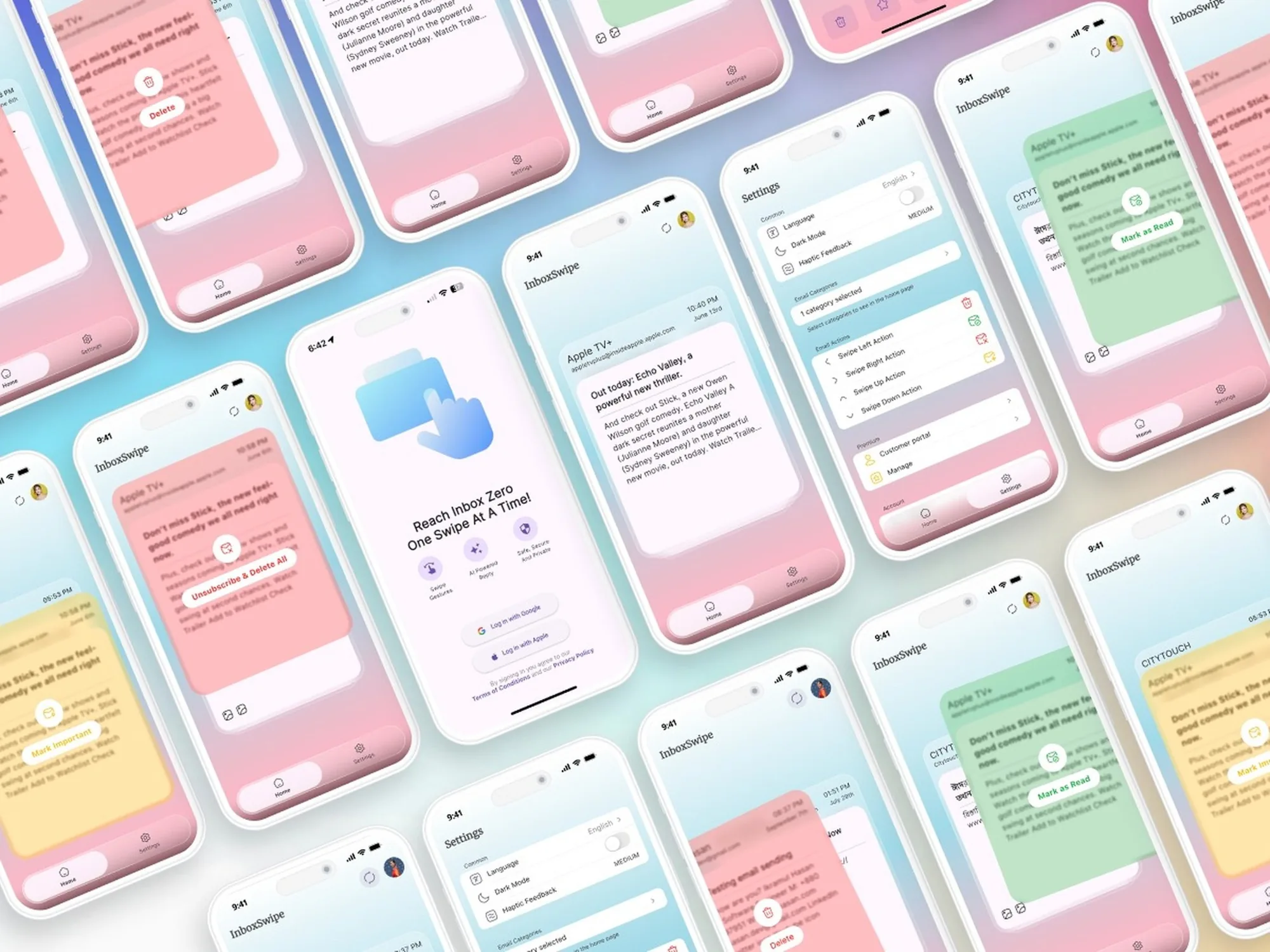
From sign-in to inbox zero in five moments
I mapped the whole journey so each step removes one excuse not to clean: setup effort, decision fatigue, writing replies, and forgetting to come back.
- One tap inSign in with Google or Apple. No forms, no passwords.
- One card in focusThe inbox opens straight into the card deck.
- Swipe it awayColour-coded feedback confirms each decision.
- Reply with AI"I'll answer later" becomes a one-tap draft.
- Make it a habitA daily reminder at a time you choose turns cleaning into a routine.
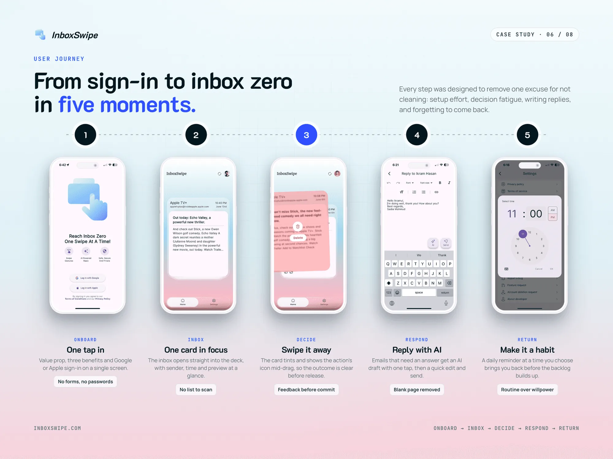
Fun on the surface, power underneath
Swiping is the hook. But people only keep an app as their daily mail client if it handles everything else too. Beneath the playful surface: AI replies, remappable actions, multiple Gmail accounts, dark mode, daily nudges, and English and Spanish support.
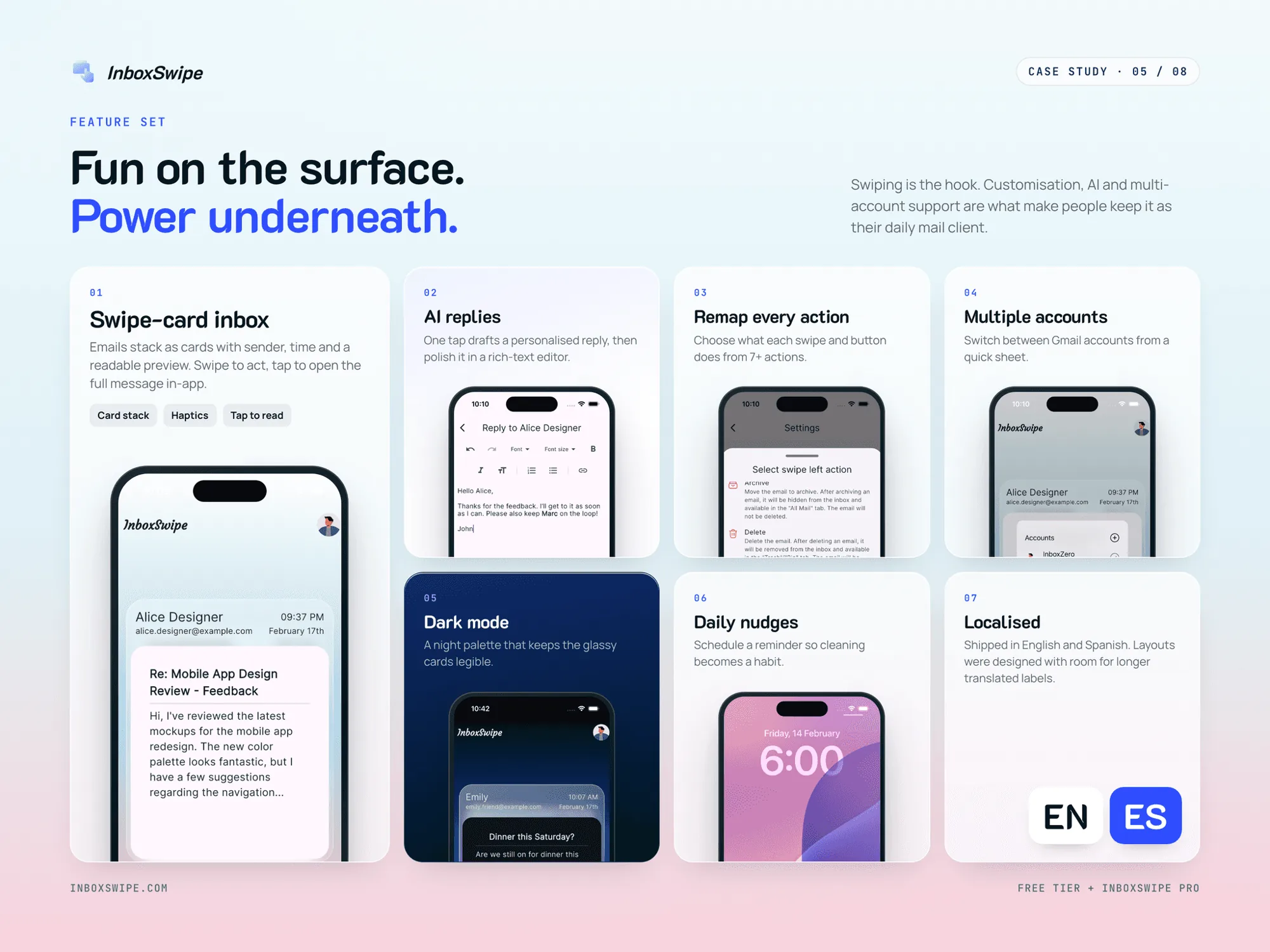
The settings screen keeps all of this in the user's control without adding complexity. The AI reply editor turns a reply you'd put off into a draft you can polish and send.
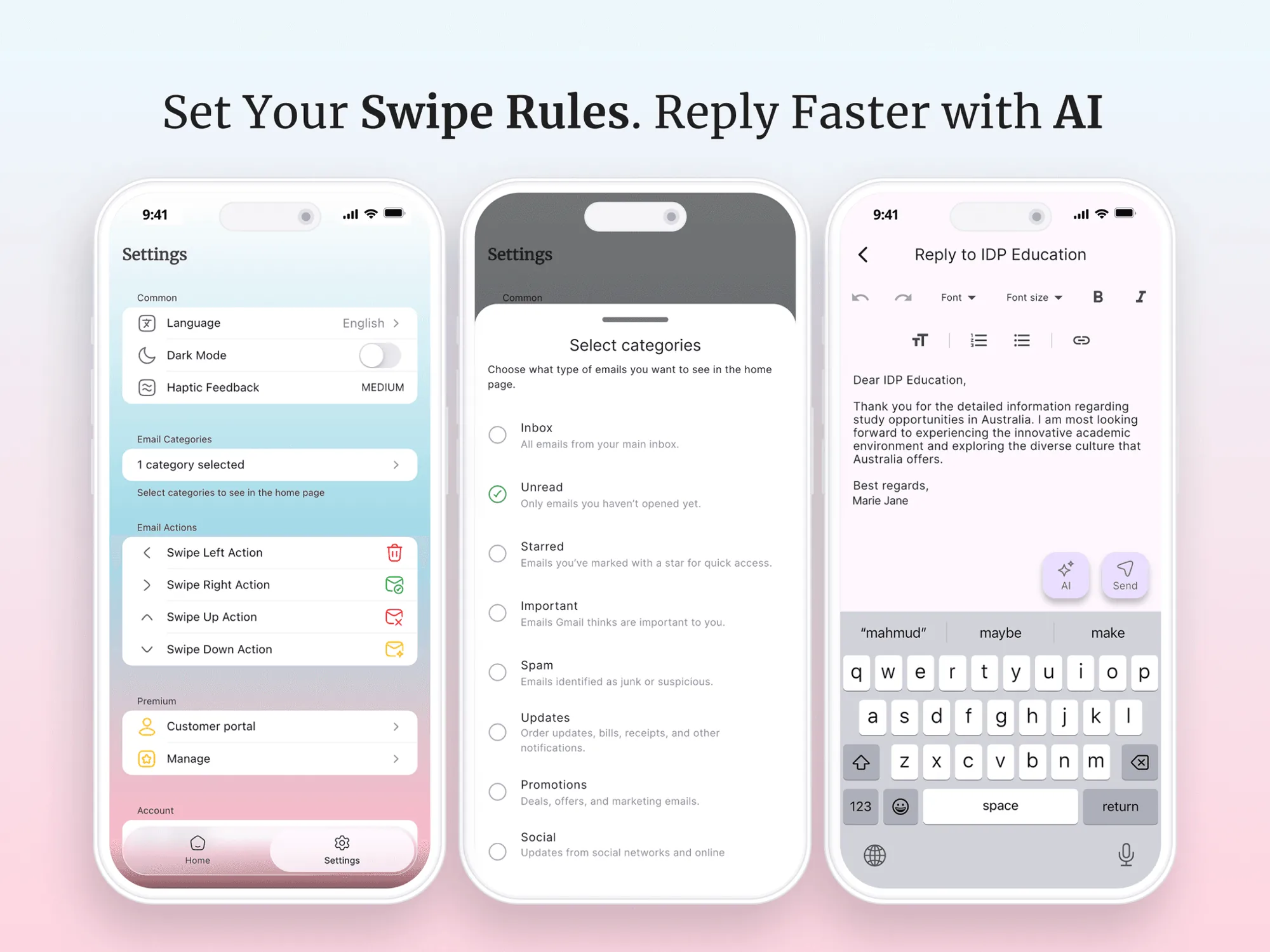
Soft surfaces, loud decisions
Email apps tend to feel cold and serious, and email causes enough stress already. So the surfaces stay calm: a sky-to-blush gradient by day and deep blue to indigo by night, with frosted-glass cards and stacked depth that hint there's more to go. Bold colour is reserved for one thing: the decision you're about to make.
- Red
Leaves inbox - Green
Read - Blue
Starred - Amber
Important - Day surface
Sky → blush
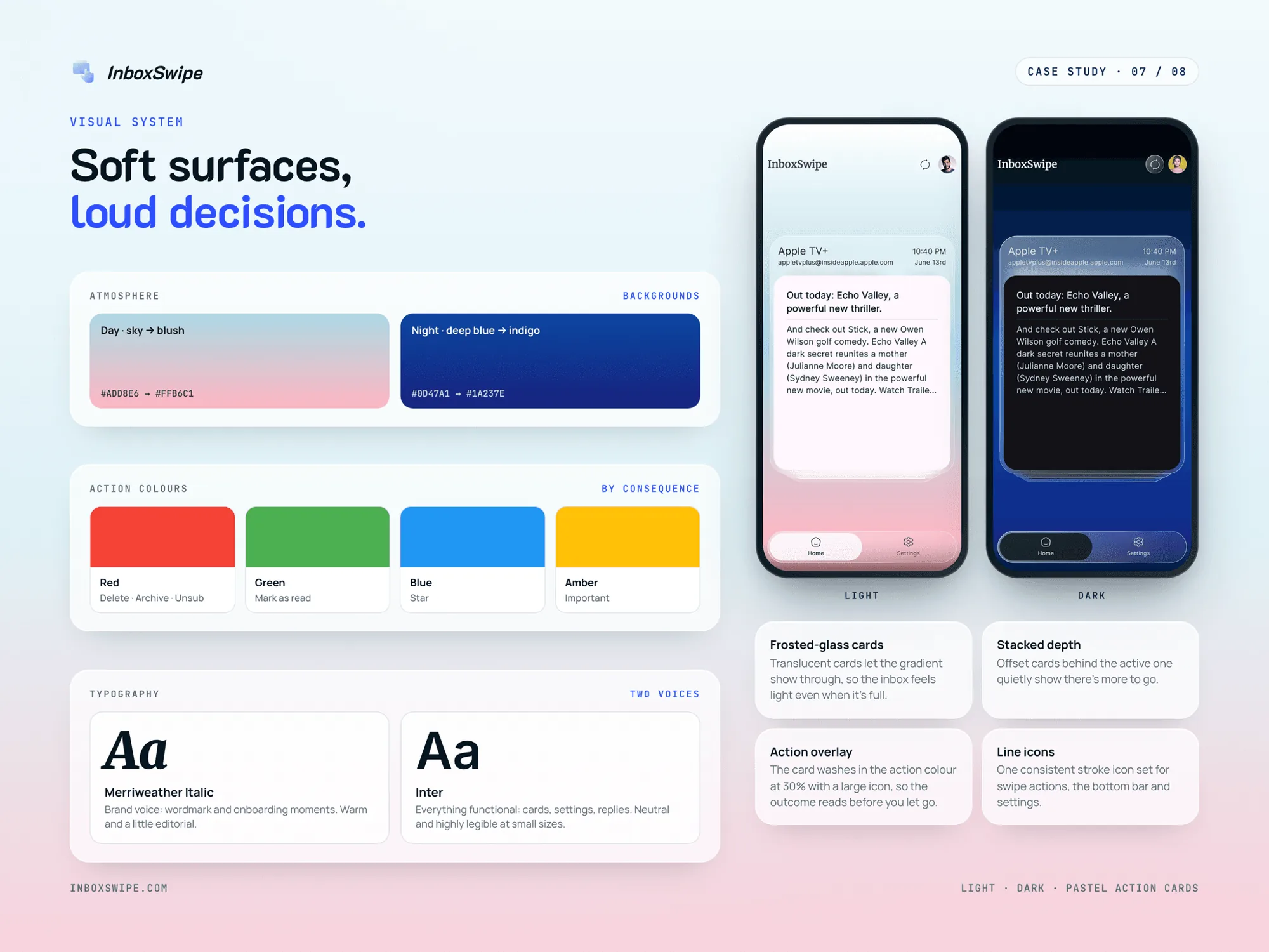
The type has two voices. Merriweather Italic carries the brand in the wordmark and onboarding. Inter handles everything functional and stays legible at small sizes.
Designing for trust. An app that reads your email has to earn trust, so security was part of the experience, not an afterthought. Clear messaging explains that the app is Google-verified, CASA Tier 2 certified and never stores your emails.
The result
InboxSwipe is live on the App Store and Google Play, with beta testers around the world. It turns one of the most dreaded digital chores into a few satisfying minutes of swiping.
- Borrowing familiar patterns is powerful.A gesture people already love can make a completely different task feel effortless.
- Fun is a feature.Delight and motivation can matter as much as efficiency.
- Feedback builds confidence.Clear visual cues let people move fast without fear of mistakes.