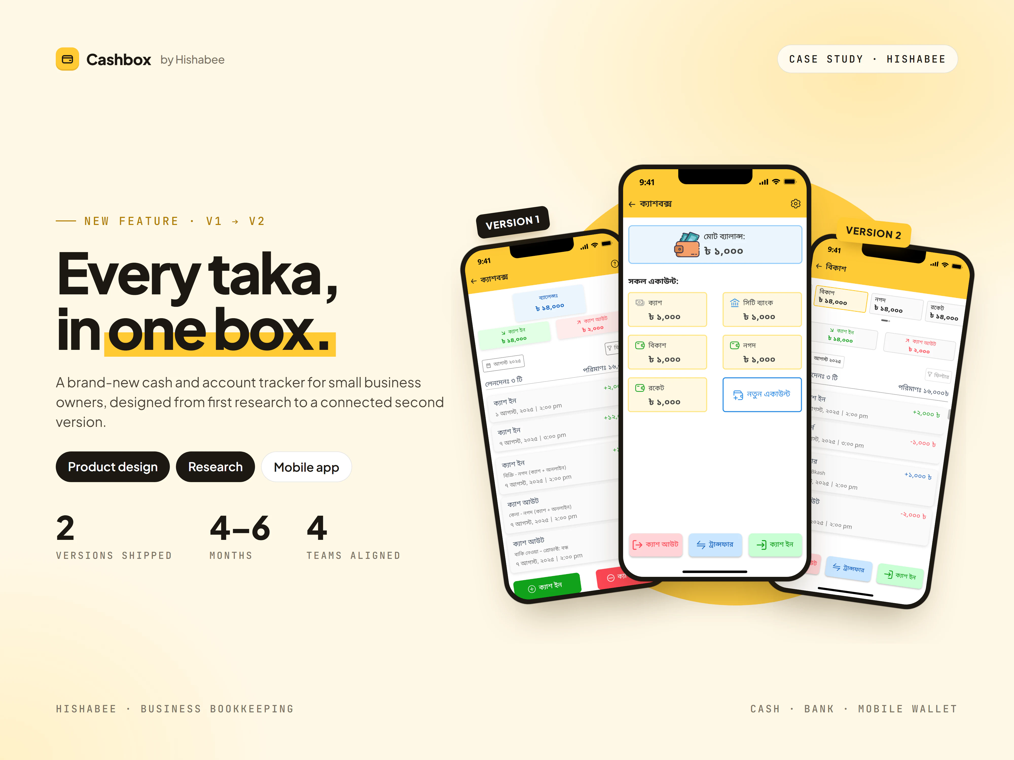
Every taka, in one box
Hishabee is a bookkeeping app for small businesses in Bangladesh. Many of its merchants still tracked the cash in their drawer on paper, or not at all. Cashbox gives them a digital version: a running balance, and a record of every taka that comes in or goes out.
It was a brand-new feature with nothing to build on inside the app. I designed both versions: a deliberately simple V1, and a V2 that grew out of what customers told us after launch.
Research, ship small, ship again
I started outside our own product. I went through the apps that already had a cashbox, noted the patterns that worked best, then matched them against what our customers were asking for. The result was one prioritised list of requirements, and a plan to launch a simple version first.
- DiscoverCompetitor analysis of apps that already offered a cashbox, looking for the strongest patterns.
- DefineCustomer requirements set against those patterns, narrowed into a single list.
- Launch V1Cash in, cash out, a running balance and a clean history.
- LearnCustomer feedback on V1 showed where a single cash balance stopped being enough.
- Launch V2Multiple accounts, transfers, categories and links to the rest of the app.
One feature, many voices. All together, the design took four to six months. Much of that time went into going back and forth with the sales, customer service, developer and product teams until everyone was on the same page about what Cashbox should be.
Cash in, cash out. Nothing more.
The first release did one job well. Merchants could see the cash in the box and every movement in and out of it, without learning anything new.
- 01
Balance first
The balance, total cash in and total cash out sit at the top. The history below shows every entry with its time and note.
- 02
Add in seconds
An entry needs only an amount and an optional note. A built-in calculator adds up mixed bills without leaving the app.
- 03
Find anything
Filter by date range or by type: cash in, cash out, purchases, sales, dues and expenses.
- 04
Fix mistakes safely
Entries can be edited in a bottom sheet. Deleting asks first, because a deleted record cannot come back.
From one box to a whole wallet
V1 proved that merchants wanted a digital cashbox. Their feedback also showed its limits. Their money didn't live in one drawer. It was split across cash, bank accounts and mobile wallets like bKash and Nagad, and Cashbox had to work with the sales, purchases and invoices they already recorded in Hishabee.
V1 answered "how much cash do I have?" V2 had to answer "where is all my money?"
A connected cashbox
V2 kept V1's simple core and added the more complex features customers asked for. Many of them connect Cashbox to other parts of the app.
Every account, one total. The home screen now leads with one combined balance, followed by a card for each account. Merchants can add mobile wallets and bank accounts, attach a QR code for collecting payments, and mark one account as the default so new entries land in the right place.
Money that moves, with a paper trail. Transfers show both accounts' balances before and after, so there are no surprises. Each account has its own history. Each entry opens to its date, invoice number, category and note, with a shortcut to the invoice. Returns get their own colour-coded record.
Guardrails that protect the money. More accounts meant more ways to lose track. Merchants can create their own categories and manage every account from one settings list. Deleting an account asks first, and an account that still holds money can't be deleted at all. The dialog points straight to a transfer instead.
The result
Cashbox went from nothing to two shipped versions. The first gave merchants a simple, trustworthy replacement for the paper cash book. The second turned it into a picture of all their money, across cash, bank and mobile wallets, connected to the rest of Hishabee.
- Ship the simple version first.A focused V1 got real feedback faster than any amount of upfront planning would have.
- Competitors set the floor, not the ceiling.Competitor analysis showed what people already expected. Our customers' requests showed what would set us apart.
- Alignment is design work.Getting sales, customer service, product and developers on the same page took as much care as the screens did.